UI / UX Design
Studylet
A B2B database tool for study agents placing students at universities abroad.
Year :
2020-2024
Industry :
DataTech
Employer :
Studylet
Project Duration :
1 year
Problem
Study agencies handle thousands of programs across hundreds of universities. In 2020, agents tracked it all in Excel and bookmarks. Tuition, deadlines, scholarship eligibility, document requirements, all of it scattered across university websites, all of it changing constantly. A typical agent juggles 40 to 80 active students. They lose deals to stale data and miss deadlines that cost them referral chains.
Positioning
Studylet is dataTech, not edTech. edTech sells UI to students. Studylet sells correct, current data to professionals whose income depends on it. Our moat was the dataset, not the interface. That framing changed how I prioritized everything from research methods to visual density.
Research methods
I ran a six-week discovery before any high fidelity work shipped.
Semi-structured interviews. 14 agents across 9 countries, 60 minutes each, video calls. I built a discussion guide with branching prompts and ran the same script across all 14 to keep the data comparable. Synthesised in Dovetail.
Contextual inquiry, remote. I shadowed 4 agents during their actual workday over screen-share, two-hour sessions each. This is where most of the real findings came from. Interviews capture what people say they do. Shadowing captures what they actually do, which was usually messier.
Diary study. 6 agents logged their daily program-research tasks for two weeks using a simple Google Form. Gave me frequency data the interviews couldn't, like how often they hit a paywall or how many scholarship lookups happened per student.
Jobs-to-be-Done framing. I used the JTBD interview structure for synthesis, which kept me focused on the agent's underlying job (close placements) rather than surface feature requests.
Affinity mapping. Two-day workshop with PM and engineering lead to cluster the qualitative data. Output was 47 distinct pain points grouped into 6 themes.
Competitive teardown. Not generic competitive analysis. I mapped 11 competitors against two axes (data freshness, agent workflow depth) and identified the empty quadrant we'd own.
Key insights
Speed compounds. Shaving research time changes how many students an agent can take on, which is their actual income lever.
Scholarships, not programs, win deals. We had massively underweighted this in scoping. I pushed to redo the data model in week four.
Trust is the ceiling. Every agent had been burned by stale data they trusted. Whatever we shipped had to make correctness visible.
Mobile is not the bet. Agents work on desktop with 12 tabs open. I scoped mobile out of v1.
Persona
Marina, 31, independent agent in Tbilisi. 55 active students placing into Germany, Netherlands, Poland, Cyprus. Commission per placement. Her day starts with 30 WhatsApp messages and ends with one deadline she nearly missed. Pays for time savings and scholarship discovery. Loses trust the moment we get one fact wrong.
Information architecture
Validated with closed card sorting across 12 agents, then tree-tested the resulting structure with 20 agents through Maze. First-click success rate hit 84% on the second iteration, up from 61% on v1.
The architecture settled on three surfaces:
Search and filter. GPA range, language, country, budget, scholarship availability, intake month, and around 30 other criteria. Filter chips, saved searches, per-student saved queries.
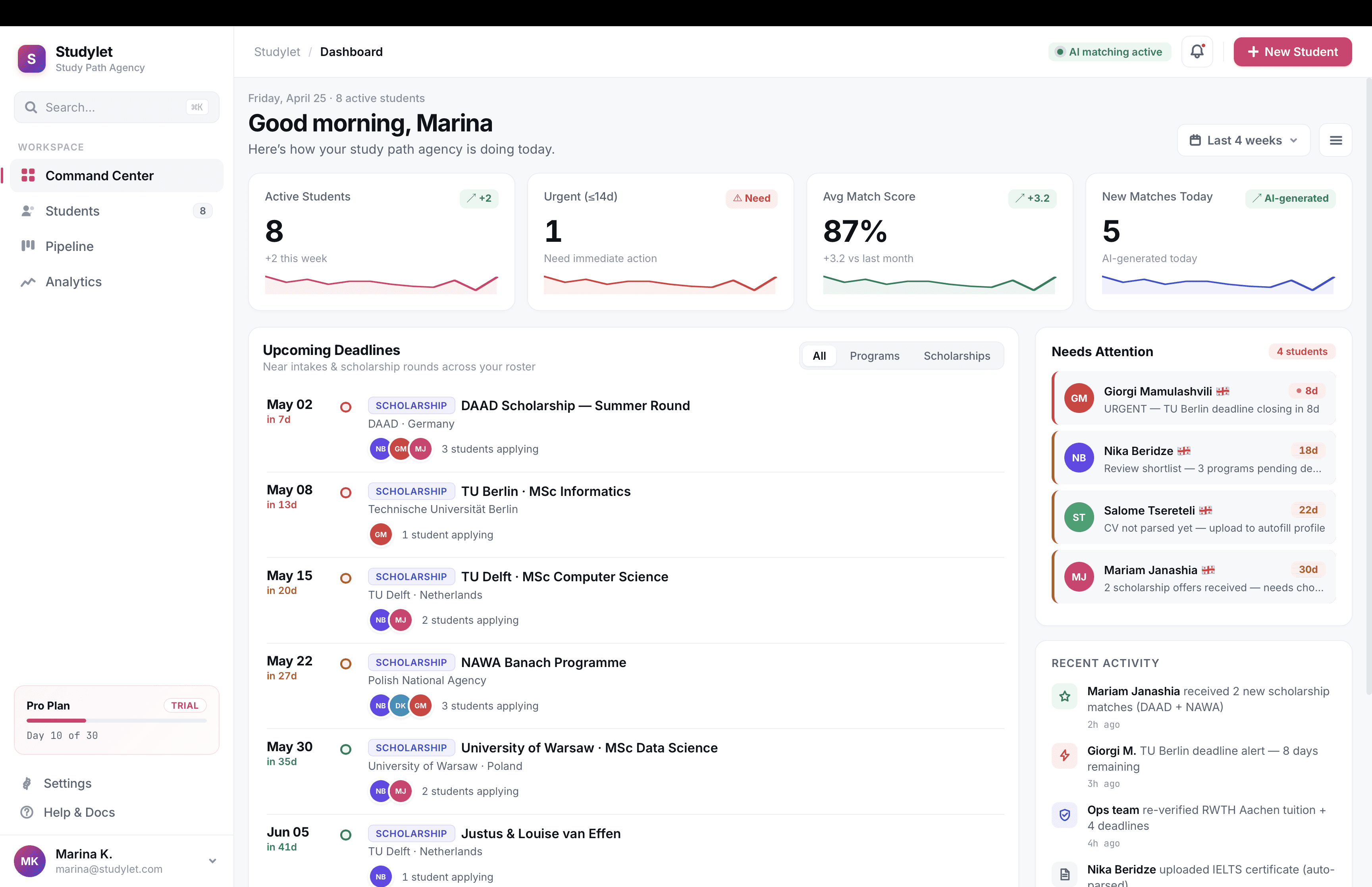
Student profiles. Structured records holding test scores, budget, preferences, documents. Once profiles existed, agents could filter the database against a saved student in one click. This was the design unlock. Average shortlist time fell hard the week we shipped it.
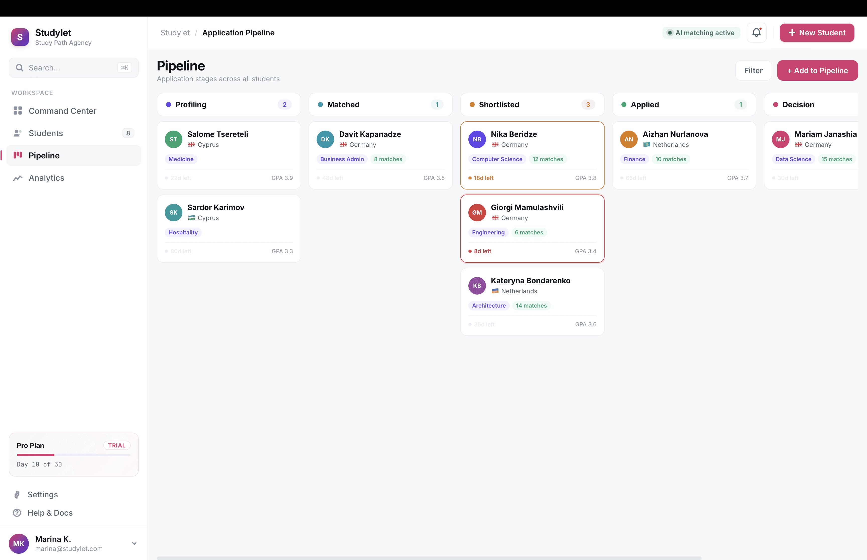
Shortlists and pipeline. Side-by-side program tables, PDF exports for client meetings, and a kanban tracker for application stages.
The trust layer
The hardest part of the job. For a product where agents stake commission on the data being right, trust runs through the whole interface, not the footer.
What I shipped:
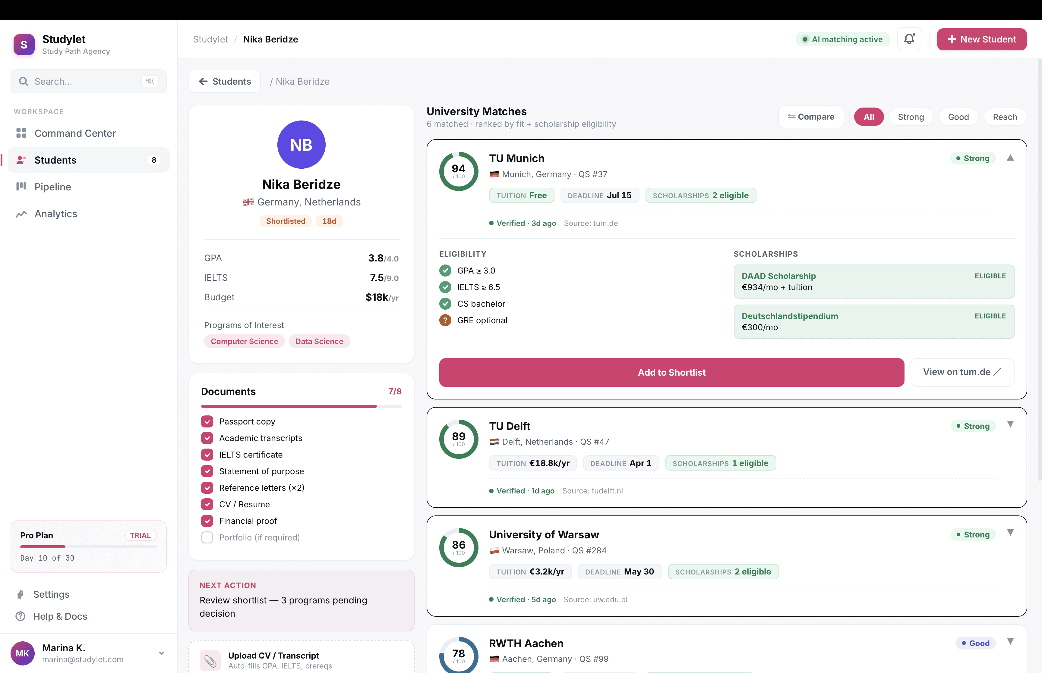
Source chips on every claim. Tuition, deadlines, eligibility rules. Each renders with the source URL and the date ops last verified it.
Visible freshness. Every program card shows "Verified 4 days ago" in plain text. Records older than 30 days get a warning chip.
Honest empty states. Where data is missing, we say so and link to the official program page. We worked to make these feel like a service rather than a bug.
Usability testing
Two rounds of moderated tests, five agents each, think-aloud protocol. Tasks were realistic agent jobs (build a shortlist for a real student, find a scholarship for a 3.2 GPA candidate, export a comparison for a client meeting). I scored sessions against a custom rubric covering completion rate, time on task, and confidence. Closed each session with System Usability Scale scoring.
Round one SUS landed at 68. Round two, after iteration, hit 84.
What broke in round one:
Filter results without visible sources weren't trusted. We surfaced source domains directly on cards instead of behind a hover.
Three-program comparison was 4x more common than predicted. We promoted compare from a buried action to a primary one.
Eligibility was rendered as paragraphs of conditions. Agents wanted yes/no/maybe per criterion. We rebuilt as a checklist component.
CV pasting into a generic notes field was rampant. We shipped a CV parser that auto-populated the profile.
Post-launch, I ran ongoing Hotjar session recordings and heatmaps to catch patterns testing missed. The kanban pipeline in v1.5 came directly from heatmap data showing agents repeatedly opening and closing a "stages" filter that didn't exist yet.
Design system
Built around the chip-and-card pattern the trust layer needed. Sourced fact chips, freshness states, eligibility checklist atoms, comparison blocks, a stricter typography scale. The point was that a cited fact looked identical whether it appeared in search, on a shortlist, in a PDF export, or on a profile. Consistency in the trust language mattered as much as consistency in the visual language. When the second designer onboarded in year two, the system cut her ramp to roughly two weeks.
Outcomes
Median shortlist time fell from 38 minutes to 4
SUS rose from 68 to 84 across two test rounds
95% of records re-verified within 30 days, held from year two onward
Around 600 active seats across 11 countries by end of 2024
What I'd do differently
Run trust research in week two, not week six. It reshaped the IA mid-stream and we paid for that in rework.
Invest in internal tooling for the ops team verifying entries earlier. They became a bottleneck during a re-verification push.
Tighten dashboard density from day one. Agents with 12 tabs open want information, not breathing room.
More Projects


UI / UX Design
Studylet
A B2B database tool for study agents placing students at universities abroad.
Year :
2020-2024
Industry :
DataTech
Employer :
Studylet
Project Duration :
1 year
Problem
Study agencies handle thousands of programs across hundreds of universities. In 2020, agents tracked it all in Excel and bookmarks. Tuition, deadlines, scholarship eligibility, document requirements, all of it scattered across university websites, all of it changing constantly. A typical agent juggles 40 to 80 active students. They lose deals to stale data and miss deadlines that cost them referral chains.
Positioning
Studylet is dataTech, not edTech. edTech sells UI to students. Studylet sells correct, current data to professionals whose income depends on it. Our moat was the dataset, not the interface. That framing changed how I prioritized everything from research methods to visual density.
Research methods
I ran a six-week discovery before any high fidelity work shipped.
Semi-structured interviews. 14 agents across 9 countries, 60 minutes each, video calls. I built a discussion guide with branching prompts and ran the same script across all 14 to keep the data comparable. Synthesised in Dovetail.
Contextual inquiry, remote. I shadowed 4 agents during their actual workday over screen-share, two-hour sessions each. This is where most of the real findings came from. Interviews capture what people say they do. Shadowing captures what they actually do, which was usually messier.
Diary study. 6 agents logged their daily program-research tasks for two weeks using a simple Google Form. Gave me frequency data the interviews couldn't, like how often they hit a paywall or how many scholarship lookups happened per student.
Jobs-to-be-Done framing. I used the JTBD interview structure for synthesis, which kept me focused on the agent's underlying job (close placements) rather than surface feature requests.
Affinity mapping. Two-day workshop with PM and engineering lead to cluster the qualitative data. Output was 47 distinct pain points grouped into 6 themes.
Competitive teardown. Not generic competitive analysis. I mapped 11 competitors against two axes (data freshness, agent workflow depth) and identified the empty quadrant we'd own.
Key insights
Speed compounds. Shaving research time changes how many students an agent can take on, which is their actual income lever.
Scholarships, not programs, win deals. We had massively underweighted this in scoping. I pushed to redo the data model in week four.
Trust is the ceiling. Every agent had been burned by stale data they trusted. Whatever we shipped had to make correctness visible.
Mobile is not the bet. Agents work on desktop with 12 tabs open. I scoped mobile out of v1.
Persona
Marina, 31, independent agent in Tbilisi. 55 active students placing into Germany, Netherlands, Poland, Cyprus. Commission per placement. Her day starts with 30 WhatsApp messages and ends with one deadline she nearly missed. Pays for time savings and scholarship discovery. Loses trust the moment we get one fact wrong.
Information architecture
Validated with closed card sorting across 12 agents, then tree-tested the resulting structure with 20 agents through Maze. First-click success rate hit 84% on the second iteration, up from 61% on v1.
The architecture settled on three surfaces:
Search and filter. GPA range, language, country, budget, scholarship availability, intake month, and around 30 other criteria. Filter chips, saved searches, per-student saved queries.
Student profiles. Structured records holding test scores, budget, preferences, documents. Once profiles existed, agents could filter the database against a saved student in one click. This was the design unlock. Average shortlist time fell hard the week we shipped it.
Shortlists and pipeline. Side-by-side program tables, PDF exports for client meetings, and a kanban tracker for application stages.
The trust layer
The hardest part of the job. For a product where agents stake commission on the data being right, trust runs through the whole interface, not the footer.
What I shipped:
Source chips on every claim. Tuition, deadlines, eligibility rules. Each renders with the source URL and the date ops last verified it.
Visible freshness. Every program card shows "Verified 4 days ago" in plain text. Records older than 30 days get a warning chip.
Honest empty states. Where data is missing, we say so and link to the official program page. We worked to make these feel like a service rather than a bug.
Usability testing
Two rounds of moderated tests, five agents each, think-aloud protocol. Tasks were realistic agent jobs (build a shortlist for a real student, find a scholarship for a 3.2 GPA candidate, export a comparison for a client meeting). I scored sessions against a custom rubric covering completion rate, time on task, and confidence. Closed each session with System Usability Scale scoring.
Round one SUS landed at 68. Round two, after iteration, hit 84.
What broke in round one:
Filter results without visible sources weren't trusted. We surfaced source domains directly on cards instead of behind a hover.
Three-program comparison was 4x more common than predicted. We promoted compare from a buried action to a primary one.
Eligibility was rendered as paragraphs of conditions. Agents wanted yes/no/maybe per criterion. We rebuilt as a checklist component.
CV pasting into a generic notes field was rampant. We shipped a CV parser that auto-populated the profile.
Post-launch, I ran ongoing Hotjar session recordings and heatmaps to catch patterns testing missed. The kanban pipeline in v1.5 came directly from heatmap data showing agents repeatedly opening and closing a "stages" filter that didn't exist yet.
Design system
Built around the chip-and-card pattern the trust layer needed. Sourced fact chips, freshness states, eligibility checklist atoms, comparison blocks, a stricter typography scale. The point was that a cited fact looked identical whether it appeared in search, on a shortlist, in a PDF export, or on a profile. Consistency in the trust language mattered as much as consistency in the visual language. When the second designer onboarded in year two, the system cut her ramp to roughly two weeks.
Outcomes
Median shortlist time fell from 38 minutes to 4
SUS rose from 68 to 84 across two test rounds
95% of records re-verified within 30 days, held from year two onward
Around 600 active seats across 11 countries by end of 2024
What I'd do differently
Run trust research in week two, not week six. It reshaped the IA mid-stream and we paid for that in rework.
Invest in internal tooling for the ops team verifying entries earlier. They became a bottleneck during a re-verification push.
Tighten dashboard density from day one. Agents with 12 tabs open want information, not breathing room.
More Projects
UI / UX Design
Studylet
A B2B database tool for study agents placing students at universities abroad.
Year :
2020-2024
Industry :
DataTech
Employer :
Studylet
Project Duration :
1 year
Problem
Study agencies handle thousands of programs across hundreds of universities. In 2020, agents tracked it all in Excel and bookmarks. Tuition, deadlines, scholarship eligibility, document requirements, all of it scattered across university websites, all of it changing constantly. A typical agent juggles 40 to 80 active students. They lose deals to stale data and miss deadlines that cost them referral chains.
Positioning
Studylet is dataTech, not edTech. edTech sells UI to students. Studylet sells correct, current data to professionals whose income depends on it. Our moat was the dataset, not the interface. That framing changed how I prioritized everything from research methods to visual density.
Research methods
I ran a six-week discovery before any high fidelity work shipped.
Semi-structured interviews. 14 agents across 9 countries, 60 minutes each, video calls. I built a discussion guide with branching prompts and ran the same script across all 14 to keep the data comparable. Synthesised in Dovetail.
Contextual inquiry, remote. I shadowed 4 agents during their actual workday over screen-share, two-hour sessions each. This is where most of the real findings came from. Interviews capture what people say they do. Shadowing captures what they actually do, which was usually messier.
Diary study. 6 agents logged their daily program-research tasks for two weeks using a simple Google Form. Gave me frequency data the interviews couldn't, like how often they hit a paywall or how many scholarship lookups happened per student.
Jobs-to-be-Done framing. I used the JTBD interview structure for synthesis, which kept me focused on the agent's underlying job (close placements) rather than surface feature requests.
Affinity mapping. Two-day workshop with PM and engineering lead to cluster the qualitative data. Output was 47 distinct pain points grouped into 6 themes.
Competitive teardown. Not generic competitive analysis. I mapped 11 competitors against two axes (data freshness, agent workflow depth) and identified the empty quadrant we'd own.
Key insights
Speed compounds. Shaving research time changes how many students an agent can take on, which is their actual income lever.
Scholarships, not programs, win deals. We had massively underweighted this in scoping. I pushed to redo the data model in week four.
Trust is the ceiling. Every agent had been burned by stale data they trusted. Whatever we shipped had to make correctness visible.
Mobile is not the bet. Agents work on desktop with 12 tabs open. I scoped mobile out of v1.
Persona
Marina, 31, independent agent in Tbilisi. 55 active students placing into Germany, Netherlands, Poland, Cyprus. Commission per placement. Her day starts with 30 WhatsApp messages and ends with one deadline she nearly missed. Pays for time savings and scholarship discovery. Loses trust the moment we get one fact wrong.
Information architecture
Validated with closed card sorting across 12 agents, then tree-tested the resulting structure with 20 agents through Maze. First-click success rate hit 84% on the second iteration, up from 61% on v1.
The architecture settled on three surfaces:
Search and filter. GPA range, language, country, budget, scholarship availability, intake month, and around 30 other criteria. Filter chips, saved searches, per-student saved queries.
Student profiles. Structured records holding test scores, budget, preferences, documents. Once profiles existed, agents could filter the database against a saved student in one click. This was the design unlock. Average shortlist time fell hard the week we shipped it.
Shortlists and pipeline. Side-by-side program tables, PDF exports for client meetings, and a kanban tracker for application stages.
The trust layer
The hardest part of the job. For a product where agents stake commission on the data being right, trust runs through the whole interface, not the footer.
What I shipped:
Source chips on every claim. Tuition, deadlines, eligibility rules. Each renders with the source URL and the date ops last verified it.
Visible freshness. Every program card shows "Verified 4 days ago" in plain text. Records older than 30 days get a warning chip.
Honest empty states. Where data is missing, we say so and link to the official program page. We worked to make these feel like a service rather than a bug.
Usability testing
Two rounds of moderated tests, five agents each, think-aloud protocol. Tasks were realistic agent jobs (build a shortlist for a real student, find a scholarship for a 3.2 GPA candidate, export a comparison for a client meeting). I scored sessions against a custom rubric covering completion rate, time on task, and confidence. Closed each session with System Usability Scale scoring.
Round one SUS landed at 68. Round two, after iteration, hit 84.
What broke in round one:
Filter results without visible sources weren't trusted. We surfaced source domains directly on cards instead of behind a hover.
Three-program comparison was 4x more common than predicted. We promoted compare from a buried action to a primary one.
Eligibility was rendered as paragraphs of conditions. Agents wanted yes/no/maybe per criterion. We rebuilt as a checklist component.
CV pasting into a generic notes field was rampant. We shipped a CV parser that auto-populated the profile.
Post-launch, I ran ongoing Hotjar session recordings and heatmaps to catch patterns testing missed. The kanban pipeline in v1.5 came directly from heatmap data showing agents repeatedly opening and closing a "stages" filter that didn't exist yet.
Design system
Built around the chip-and-card pattern the trust layer needed. Sourced fact chips, freshness states, eligibility checklist atoms, comparison blocks, a stricter typography scale. The point was that a cited fact looked identical whether it appeared in search, on a shortlist, in a PDF export, or on a profile. Consistency in the trust language mattered as much as consistency in the visual language. When the second designer onboarded in year two, the system cut her ramp to roughly two weeks.
Outcomes
Median shortlist time fell from 38 minutes to 4
SUS rose from 68 to 84 across two test rounds
95% of records re-verified within 30 days, held from year two onward
Around 600 active seats across 11 countries by end of 2024
What I'd do differently
Run trust research in week two, not week six. It reshaped the IA mid-stream and we paid for that in rework.
Invest in internal tooling for the ops team verifying entries earlier. They became a bottleneck during a re-verification push.
Tighten dashboard density from day one. Agents with 12 tabs open want information, not breathing room.